
Easy-to-read Ganita Prakash Class 7 Notes and Part 2 Chapter 5 Connecting the Dots Class 7 Notes save valuable study time during exam season.
Class 7 Maths Chapter 5 Connecting the Dots Notes
Class 7 Connecting the Dots Notes
Statistical Questions and Statements
A statistical question is a question that can be answered by collecting and analysing data.
A statistical statement is a claim or summary about some phenomenon, expressed in terms of numerical values, proportions, probabilities or predictions.
A non-statistical question does not need data collection as it has usually one, fixed answer.
Asking a statistical question, collecting data, analysing it and making a statistical statement together form the statistical process.


Visualisation of data with a Dot Plot
A dot plot is a simple way of visualising data using dots, where each dot represents one observation.
In a dot plot:
- Spacing between the horizontal and the vertical lines must be equal.
- The dots are placed in a line or a row, usually along a number line.
- If the same observation occurs more than once, place the dots one above the other.
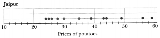
For example, the given data shows how the prices of potatoes change across different months of the year in Jaipur.
| Month | Jan | Feb | Mar | Apr | May | Jun | Jul | Aug | Sep | Oct | Nov | Dec |
| Price in Jaipur (in ₹/ kg) | 25 | 24 | 43 | 28 | 30 | 35 | 39 | 26 | 49 | 56 | 59 | 44 |
The dot plot for the given data is drawn as:
Range of the given data is difference between its extremes, i.e. the difference between the highest and the lowest values in the dataset.
Range = Highest Value (Maximum) Lowest Value (Minimum)
Representative Value of the Data
A representative value of a dataset is a single number, often called a measure of central tendency, that summarises the entire dataset.
Average or Arithmetic mean (or simply Mean) is the value we get when we add up all the observations in the group and divide the total by the count of observations in the group.
\(\text { Mean }=\frac{\text { Sum of all values in the data }}{\text { Number of values in the data }}\)
The value of the Arithmetic mean depends on the total of all values and number of values, so more observations do not guarantee a higher mean.
The Median of a data set is the value in the middle, when all observations are arranged in order. It splits the data into two groups of equal size.
If n is odd, Median = value of the \(\left(\frac{n+1}{2}\right)^{\text {th }}\) observation
If n is even, \(\text { Median }=\frac{\text { value of the }\left(\frac{n}{2}\right)^{\text {th }} \text { observation }+ \text { value of }\left(\frac{n}{2}+1\right)^{\text {th }} \text { observation }}{2}\)
An outlier is a data value which significantly deviates from the rest of the values in the data set.
Effect of Outliers on Mean and Median:
The mean may move up (or down), depending on the presence of an outlier to the right (or left).
The median usually remains near the centre of the main cluster of data and is more stable than the mean (especially in presence of outliers).
Mean is sensitive to outliers, while the median is more stable and often better represents the central tendency of the complete data set.
While working with data, it is important to understand the difference between a zero value and no value. For example, in a cricket match:
A score of 0 means the player played and scored 0 runs. Therefore, it must be counted to find mean or median.
A blank (no score) means the player did not bat in that match. Therefore, that match should not be counted while finding the average.
Visualisation of data with a Double Bar Graph
A clustered bar graph is a type of bar graph in which two or more bars are placed side by side to compare related quantities.
Like the single bar graphs, clustered bar graphs can be of two types: Horizontal and Vertical, depending on the orientation of bars.
A double bar graph is a special case of a clustered bar graph in which exactly two bars are drawn for each category such as a team, a place, a time period, a type of item etc.
To draw a double bar graph for a given data, follow the steps given below:
Step 1: Draw axes and choose a scale: Draw vertical and horizontal axes, label them, and select a common scale for the vertical axis (or horizontal axis in case of horizontal double bar graph).
Step 2: Draw bars for each data set: For each category, draw bars of equal width side by side, using different colours or patterns.
Step 3: Add title and key: Give the graph a proper title and include a key (legend) to identify each data set.
Step 4: Check and label carefully: Ensure all bars are correctly labelled and spaced evenly.
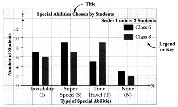
For example, for the given data:
|
Special Abilities Chosen by Students |
||||
|
Invisibility (I) |
Super Speed (S) |
Time Travel (T) |
None(N) |
|
| Class 6 |
7 |
9 |
5 |
3 |
| Class 8 |
6 |
7 |
9 |
2 |
The double graph is drawn as:
Interpretation of Double Bar Graphs
Interpreting a graph means studying it carefully to understand the information shown, comparing values, and drawing meaningful conclusions from the data.
To make sense of the data easily, we can follow a simple two-step process:
Step 1: Observe and identify the given data
- To do this, first read the title of the graph to know what is being measured and compared.
- Next, observe the x-axis and y-axis to identify the categories shown and the unit of measurement.
- Finally, check the scale of the graph so that the values and differences can be interpreted correctly.
Step 2: Analyse the data and make inferences
- To do this, analyse the values shown in the graph.
- Compare the data for different categories.
- Draw conclusions based on your observations.
A well-drawn graph must be clear and accurate: It should have a proper title, correctly labelled axes, a common scale, equal spacing, and a key so that the data can be understood easily.
Introduction
Statistical questions are questions that involve variability in data and require data collection and analysis to answer.
A data set is an organised collection of related information or numerical values,
Range is the difference between the maximum and minimum values in a data set.
Representative Value
A representative value of a data set is a single number, often called a measure of central tendency, that summarises the entire data set. For example, mean and median.
| Arithmetic Mean (Average) | Median |
| \(\text { Mean }=\frac{\text { Sum of all observations }}{\text { Number of observations }}\) | Median is the middle value of an ordered data. |
| Mean can be understood as fair share or equal distribution. | If number of observations i.e., n is even, \(\text { Median }=\left(\frac{n+1}{2}\right)^{\text {th }} \text { value }\) |
| Mean is widely used in daily life (rainfall, height, income, prices, sports performance) | If number of observations i.e., n is even, \(\text { Median }=\frac{\left(\frac{n}{2}\right)^{\text {th }} \text { value }+\left(\frac{n}{2}+1\right)^{\text {th }} \text { value }}{2}\) |
Note:
- An outlier is a number that is very different from the others in a set of data — it is much bigger or much smaller than most of the values.
- The mean can be easily affected by outliers, but the median usually stays the same and gives a better idea of the middle of the data set.
Visualisation of Data
Data visualisation helps in understanding data better using tools like dot plots and clustered bar graphs.
|
Dot Plots |
Double Bar Graphs |
| A dot plot is a simple, visual graph used to represent numerical data by placing dots above a labeled number line. | Double bar graphs are used to compare two related quantities by showing a pair of bars for each category using the same scale. |
In a dot plot:
|
To draw a double bar graph for a given data, follow the steps given below: Step 1: Draw axes and choose a scale Step 2: Draw bars for each data set Step 3: Add title and key Step 4: Check and label carefully |
Interpreting the Graphs
Interpreting a graph means studying it carefully to understand the information shown, comparing values and drawing meaningful conclusions from the data.
To make sense of the data easily, we can follow a simple two-step process:
Step 1: Observe and identify the given data
Step 2: Analyse the data and make inferences