
Easy-to-read Ganita Prakash Class 6 Notes and Chapter 4 Data Handling and Presentation Class 6 Notes save valuable study time during exam season.
Class 6 Maths Chapter 4 Data Handling and Presentation Notes
Class 6 Data Handling and Presentation Notes
Data and Information
Data is a collection of facts or observations. It can be about anything—people’s favourite colours, shoe sizes, temperatures, or the number of pets in a classroom.
There are two main types of data:
Qualitative Data – describes qualities (e.g., colours, names, feelings).
Quantitative Data – involves numbers or measurements (e.g., height, age, scores).
The data that has been collected in the original form is called raw data.
Each item in the raw data is called an observation.
Organisation of Data
The process of systematically arranging the collected data or raw data so that it can be easy to understand and analyse, is known as organisation of data.
Organised data is called information.
Organising the data by arranging it in ascending or descending order is called an array.
Frequency is the number of times a particular observation or value appears in a list.
The range of dataset is the difference between the highest and lowest values in the dataset.

Representation of Data
A frequency distribution shows the frequency of items in a tabular form or graphical form.
Tally marks are short vertical lines used to count items. Each time we count one item, we draw one line (|). After four lines (| | | |), we draw a oblique line (\) across them to show five like this:  to make counting easier.
Pictograph
A pictograph uses pictures of objects to represent data, making it easy to answer questions about the data with just a quick glance.
Scaling refers to assigning a numerical value to each picture or symbol used to represent data.
To decide how many items one symbol should represent, we look for a number that can divide all the values in the data. This number is called a common factor.
Using the biggest common factor, also called the Greatest Common Factor (GCF), helps us use fewer symbols and makes the chart neater.
To draw a pictograph for a given data, follow the steps given below:
Step 1: Collect and tally the data: Gather the information you want to show (for example, count how many students were absent in each class) and total it for each category.
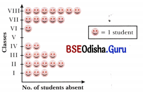
Step 2: Decide the scale: Choose how many items one icon will represent (based on highest common factor). Pick a scale that keeps your chart neat and easy to read and explain what one icon stands for.
symbols and makes the chart neater.
Step 3: Draw the axis: Create a horizontal and vertical line to list the categories (such as class names or days of the week). This helps organise the data visually.
Step 4: Use icons to show the data: Start placing lull icons according to your data. If needed, use half icons to show half amounts that don’t match a full icon.
Bar Graph
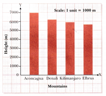
A bar graph is a type of chart that uses bars (columns) to represent data. Each bar’s height or length corresponds to the quantity or frequency of the category it represents.
It is called a graphical representation because it turns numbers into visual bars, making complex data easier to understand.
Key Properties of a Bar Graph:
- Each bar is drawn with the same width.
- All bars are separated by equal gaps.
- The height of each bar corresponds to the value it represents. A taller bar means a greater value.
- All bars start from the same horizontal line (called the x-axis or baseline), ensuring consistency.
- Bars can be drawn vertically (upwards) or horizontally (sideways), but the interpretation remains the same.
- A scale is marked on the axis (usually the vertical axis) to show the values or frequencies that the bars represent. This helps in reading exact values.
From a given set of data, we can create a bar graph by following steps given below: s
Step 1: On the graph paper, draw a horizontal line and a vertical line. The horizontal line in a graph is called the x-axis, while the vertical line in a graph is called the y-axis. The horizontal line (x-axis) and vertical line (y-axis) intersect at zero.
Step 2: Along the horizontal line, mark points at equal distances and write the names of the items for which the data is to be represented.
Step 3: Choose a suitable scale for the given data.
Step 4: Determine the heights of different bars according to the scale.
Step 5: On x-axis draw bars of equal width and keep the distance between the bars same. Also remember to keep the same distance between the first bar and they-axis.
Artistic and Aesthetic Considerations
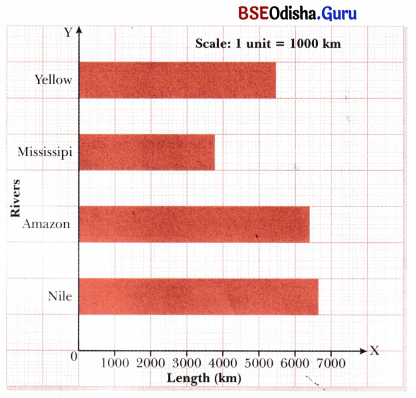
In general, it is more intuitive and visually appealing to represent heights, that are measured upwards from the ground, using bar graphs that have vertical bars (columns graph).
Lengths that are parallel to the ground (for example, distances between locations on Earth) are usually best represented using bar graphs with horizontal arcs.
Infographics
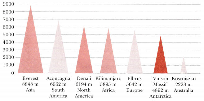
When data visualizations, like bar graphs, are made even more visually attractive with artistic touches, they are called information graphics or infographics for short.
The purpose of infographics is to use eye-catching and engaging visuals to present information in a way that is clear, quick to understand and visually appealing. For example, instead of using rectangles (bars), we could use triangles to look more like actual mountains. We can even add colours to make it more interesting.
Introduction
Any collection of facts, numbers, measures. observations or other descriptions things that convey information about those things is called data.
The data that has been collected in the original form is called raw data.
Each item in the raw data is called an observation.
Organisation of Data
The process of systematically arranging the collected data or raw ttata so I hat it becomes easy to understand and analyse the data is known as organisation of data.
Organising the data by arranging it in ascending or descending order is called an array.
The frequency of given observation is the number of times it occurs in the data.
Frequency Distribution
A frequency distribution shows the frequency of items in a tabular form or graphical form.
| Sports | Number of students |
| Badminton | 5 |
| Cricket | 10 |
| Hockey | 2 |
| Football | 12 |
Tally Table
Tally marks are short vertical lines used to count items. Each time we count one item, we draw one line (|). After four lines (||||), we draw a oblique line (\) across them to show five i.e. ().
| Sports | Number of students |
| Badminton | |
| Cricket | |
| Hockey | || |
| Football | || |
Representation of Data
Pictograph
A pictograph is a way of representing data using pictures or symbols.
Scaling refers to assigning a numerical value to each picture or symbol used to represent data.
To decide how many items one symbol should represent, we look for a number that can divide all the values in the data. This number is called a common factor.
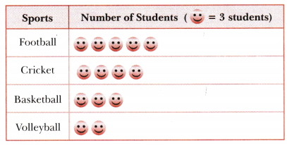
Note: Bar graphs are better for large data because they are neat, easy to read, and can show big numbers clearly.
Bar graphs
Like pictographs, bar graphs give a nice visual way to represent data. They represent data through equally- spaced bars, each of equal width, where the lengths or heights give frequencies of the different categories.
Scale is decided on the basis of the data including the minimum and maximum frequencies, so that the resulting bar graph fits nicely and looks visually appealing on the paper or poster we are preparing.
The markings of the unit lengths as per the scale must start from zero.
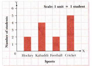
Artistic and Aesthetic Considerations
It is also good to make the graph look neat, colourful, and easy to understand, so that anyone looking at it can enjoy and learn from the information.
In general, it is more intuitive, suggestive and visually appealing to represent heights, that are measured upwards from the ground, using bar graphs that have vertical bars or columns.
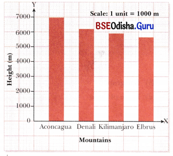
Lengths that are parallel to the ground (for example, distances between location on Earth) are usually best represented using bar graphs with horizontal bars.
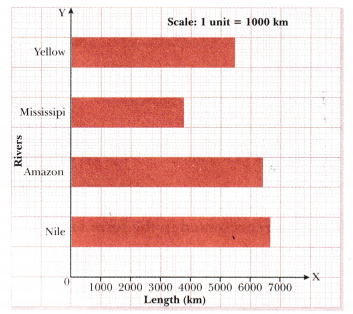
When data visualizations, like bar graphs, are made even more visually attractive with artistic touches, they are called information graphics or infographics.
However, making visual representations of data ‘fancy’ can also sometimes be misleading.